
Creative Branding in Regulated Industries: How Pharmaceutical Companies Can Stand Out
It is a fair question, and one that comes up often when working in pharmaceutical branding and clinical trial design. Can you be creative in a regulated industry without compromising compliance? The assumption is usually no. Regulation is seen as a constraint, something that narrows options and forces everything into the same safe, familiar space. Over time, that assumption has shaped how many brands in healthcare present themselves.
Spend enough time looking at pharmaceutical and healthcare branding and a pattern emerges quickly. Blue colour palettes. Cool, clinical photography. Corporate typefaces. Messaging that prioritises caution over connection. It is all so consistent that you could remove the logo from most of these brands, replace it with a competitor's, and nobody would notice the difference. That is not a coincidence — it is an industry that has convinced itself that creativity in a regulated industry is either too risky, too complicated, or simply not the point. None of those things are true.
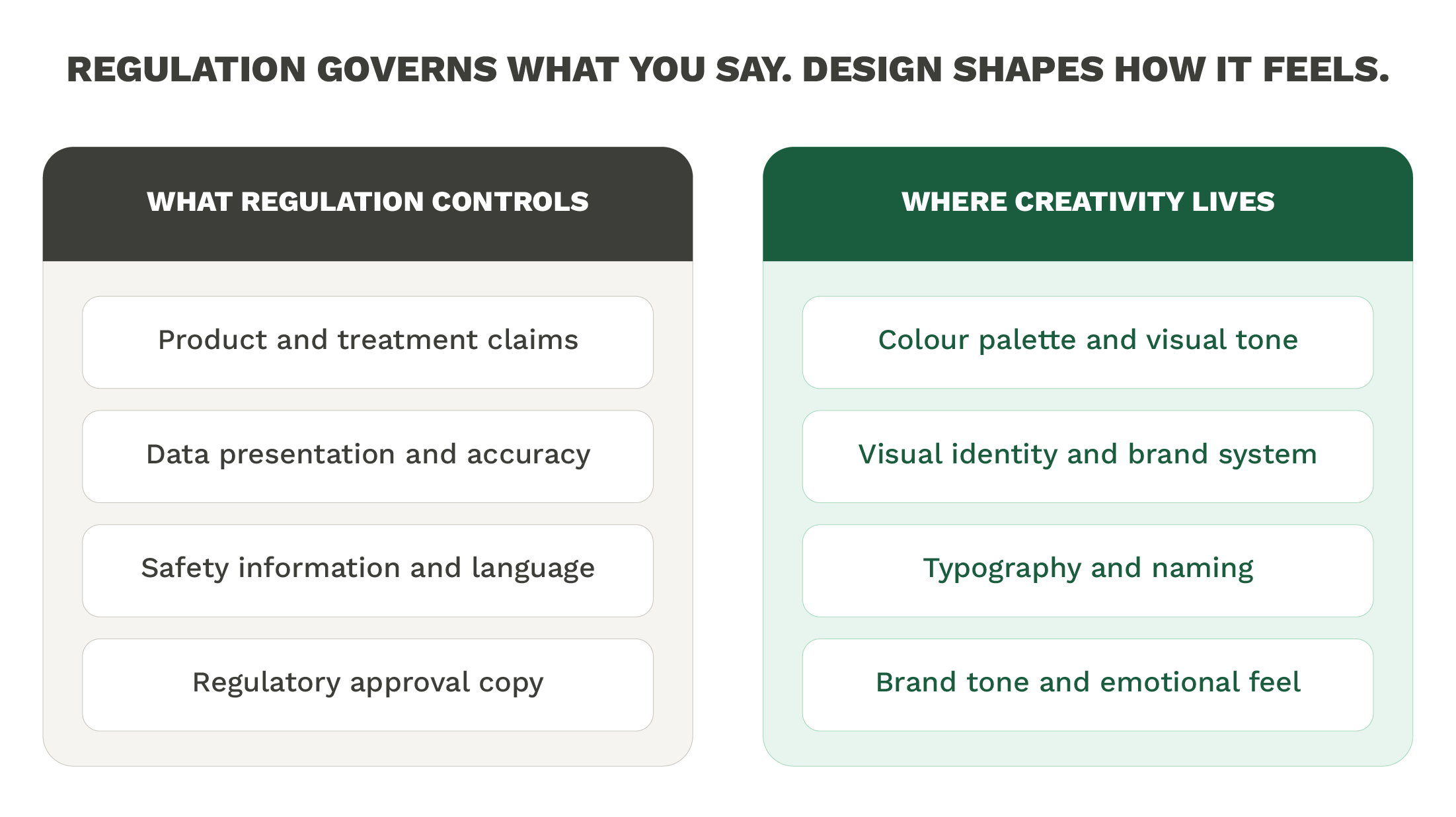
The assumption tends to go something like this: regulation limits what you can say, so it must also limit how you can look and feel. But those two things are not the same. Regulatory frameworks govern claims, data presentation, approval processes, and product information. They do not mandate that every brand looks identical. That particular uniformity is a choice, and it is one that quietly damages how organisations are perceived by patients, by healthcare professionals, and by anyone else they are trying to reach.
The Cost of Playing It Safe in pharma branding
There is a reasonable explanation for why regulated industries default to conservative branding. Legal review processes are thorough. Approval cycles are long. The easiest path through those processes is to produce work that nobody objects to (and nobody objects to bland). But nobody remembers it either.
The problem is that patients, clinicians, and healthcare decision-makers are still human beings. They respond to the same cues as everyone else: colour, tone, clarity, warmth, trust. A brand that feels cold and corporate does not become more credible because it looks serious. In many cases it has the opposite effect. It creates distance when closeness would serve the organisation better.
Research published in the Journal of Medical Internet Research has highlighted how patient engagement and trust are directly influenced by the quality of health communication materials — including how they are designed. Visuals and tone shape whether someone feels understood or processed. That finding applies just as much to a clinical trial recruitment poster as it does to a patient-facing app.
The pharmaceutical and biotech sectors invest enormous resources in the science. The communication around that science often receives a fraction of the same attention. That imbalance shows.
Creativity Within Structure
The good news is that branding in regulated industries does not require abandoning creativity. It requires understanding where the constraints actually sit, and designing intelligently within them. That is a different skill from ignoring the rules, and it is a more useful one.
Colour is a practical example. The pharmaceutical sector has a well-documented attachment to blue — it signals trust, cleanliness, professionalism. Those associations are real, but so is the saturation. When every brand in a category uses the same palette, none of them communicate anything distinctive. A considered choice to move away from that default, while staying within what is appropriate for the audience and context, is not reckless. It is good design thinking.
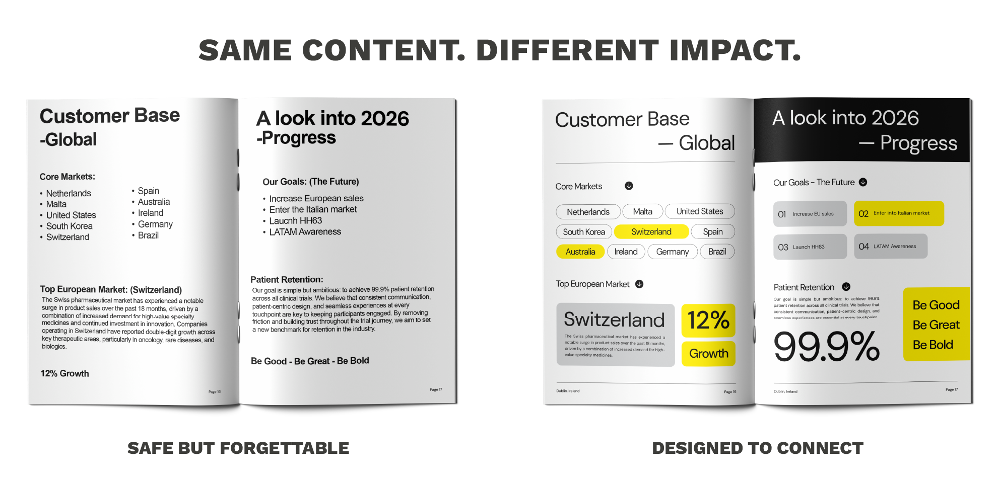
When we worked on the Serenta clinical trial brand, the brief was built around that exact challenge. The goal was to create something that felt warm and trustworthy rather than clinical and detached — because the people being recruited into that study were patients, not data points. A warmer colour palette was a deliberate decision, chosen to make participants feel invested in the study rather than processed through it. The brand remained fully compliant. It simply did not look like everything else, and that was the point.
That kind of thinking is available to any organisation operating in a regulated space. It requires working with people who understand both the creative and the compliance dimensions of the work — not treating those as separate conversations.
What Regulated Brands Get Wrong Most Often
The most common mistake is not a dramatic one. It is a sequencing problem. Brand decisions get made early, often by committee, with legal sign-off as the primary filter. Design enters the process late, working within constraints that were set without design thinking in mind. The result is work that satisfies the checklist and communicates almost nothing.
A more considered approach treats brand as part of the strategy from the beginning and not a coat of paint applied at the end. What does this organisation need to communicate? To whom? What does it need people to feel? Those questions have answers that regulation does not prevent. They just require asking them early enough, and with enough conviction to act on the answers.
There is also a tendency to treat all regulated communication as identical in purpose. A clinical trial recruitment campaign has different needs from a product launch. An investigator meeting has different needs from a patient-facing website. A consistent brand system, designed with clarity and flexibility can support all of those contexts without looking like it was built for none of them. That is what pharmaceutical branding done well actually looks like in practice.
Creativity in a regulated industry is not about finding loopholes or pushing boundaries for its own sake. It is about recognising that the boundaries are narrower in some directions than others, and that there is more room to work with than most organisations choose to occupy. The brands that understand that tend to be the ones that patients and professionals actually remember — and trust.
If that is a conversation worth having about your organisation, get in touch.