
The Visual Identity Mistakes Pharma Companies Keep Making With Their Clinical Studies
Most clinical trial teams are good at science. They are precise about protocols, rigorous about data, and highly focused on results. What they are often much less careful about is how their study looks. And more importantly, what that communicates to the people they are trying to recruit.
The visual identity mistakes pharma companies keep making with their clinical studies tend to follow a familiar pattern. They are not dramatic failures. They are quieter than that. A logo lifted from the parent company's brand guidelines, a colour palette chosen because it was already there, a trial name that nobody outside the research team could interpret or remember. None of these feel like mistakes in the moment. They feel like practical decisions made by busy people with more pressing priorities. But they accumulate, and they cost more than most teams realise.
The Parent Brand Problem
There is a logic to borrowing from the corporate brand. It saves time, it feels consistent, and it avoids a conversation about budget. But a clinical trial is not a product launch. It is not a corporate communication. It exists in a very specific context — one that involves patients, ethics committees, site coordinators, investigator meetings, and in many cases, a public-facing presence on registries like the EU Clinical Trials Register or ClinicalTrials.gov.
When a trial carries the full weight of its parent company's branding, it signals something unintentional. It suggests the study is an extension of a commercial interest rather than a distinct scientific undertaking. For patients especially, that distinction matters. Trust in clinical research is already a complicated thing. Anything that blurs the line between a pharmaceutical company's commercial identity and the integrity of its research does not help.
A well-considered trial brand does something the parent brand cannot. It gives the study its own clear purpose, its own tone, and its own visual language. It says, clearly, that this is a separate thing — built for this specific purpose, with this specific population in mind. That clarity is not cosmetic. It is functional.
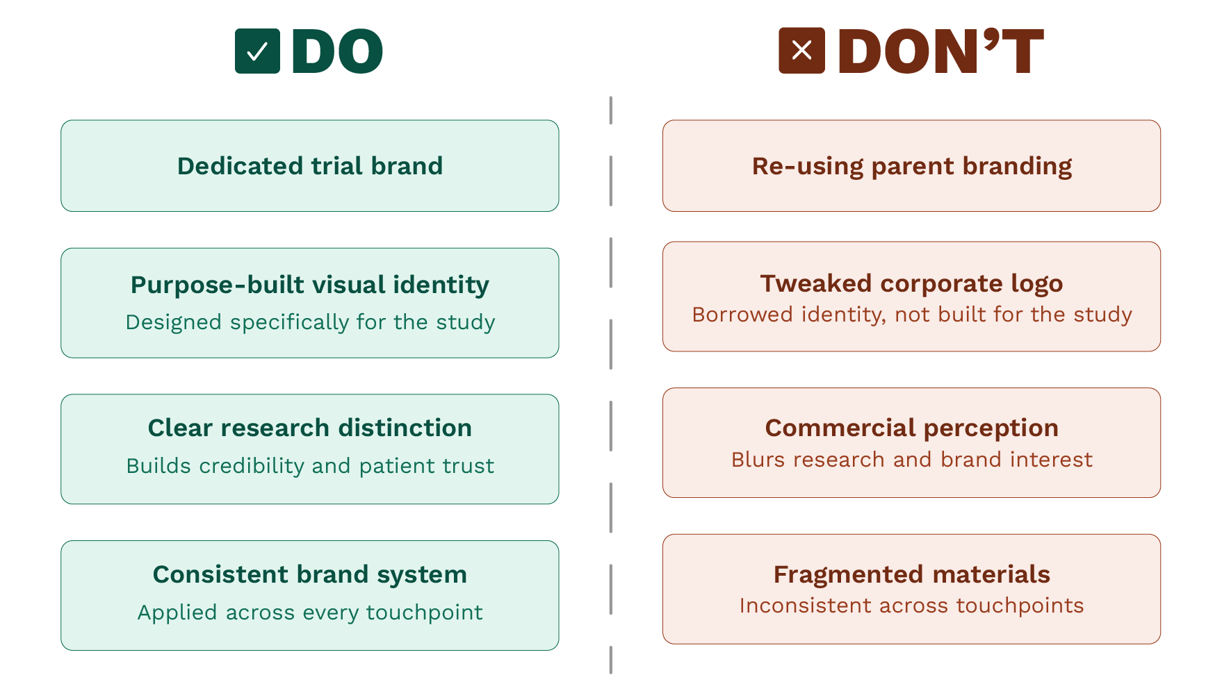
A quick-reference guide to the two approaches clinical trial teams take with their study branding — and why the distinction matters for patient trust, site consistency, and the overall credibility of the research.
Recruitment Is a Design Problem
Patient recruitment is one of the most persistent challenges in clinical research. Studies routinely fall behind their recruitment timelines, and the downstream effects of that — extended trial duration, increased cost, delayed regulatory submissions are well documented. The Tufts Centre for the Study of Drug Development has tracked for years how recruitment failures affect trial outcomes, and the picture has not changed much.
Design is rarely named as part of the solution. But it should be. A patient encountering a clinical trial for the first time through a GP referral, a poster in a waiting room, a page on a hospital website — is forming an impression very quickly. That impression is shaped by how the study presents itself visually. Does it feel considered? Does it feel credible? Does it feel like something built with care?
These are not questions patients ask consciously. But they answer them instinctively. A study that looks like it was assembled from a stock template, or that carries the visual identity of a pharmaceutical company without any adaptation, does not build the kind of immediate trust that encourages someone to take the next step. A clear, consistent brand designed specifically for the study does.
The same applies to site staff, investigators, and coordinators. People working across multiple sites are handling a significant volume of information. A study that has a coherent, structured visual identity is easier to work with. Materials are clearer. Communication is more reliable. The study feels real, and that matters more than it might seem.
What Gets Left Behind When Branding Is Treated as an Afterthought
The most common version of this mistake is not negligence. It is a sequencing problem. Trial branding tends to get addressed (if it gets addressed at all) after the protocol is finalised, after the sites are selected, sometimes after recruitment has already begun. By that point, there is no time to do it properly, so a practical shortcut is taken instead.
The result is a fragmented visual presence across materials. The patient information leaflet looks different from the investigator brochure. The study website, if there is one, does not match the poster in the clinic. Nothing is quite wrong, but nothing is quite right either, and that inconsistency is felt even when it is not consciously noticed.
A considered approach to trial branding starts earlier than most teams think it should. It is part of the planning process, not a task to be handed off at the end. That does not mean it needs to be a lengthy or expensive exercise. It means it needs to be intentional, and it needs to be designed to support the full lifecycle of the study. From first patient contact through to close-out.
At 6 Egg Design, this is the work we do most consistently for clinical research teams: building visual identities that are practical, compliant, and designed to function across every touchpoint a study requires. The Serenta project is a good example of what that looks like in practice — you can see the thinking behind that work here.
The teams that treat trial branding as a real discipline — not a visual afterthought, not a borrowed set of assets — tend to find that it pays back in ways that are hard to measure directly but easy to notice. Cleaner communication. Faster site adoption. Patients who feel like they are engaging with something that was built with them in mind rather than assembled in a hurry.
If you are at the planning stage of a clinical study and branding is not yet part of the conversation, it probably should be. Getting in touch is a good place to start.