

Serenta is a clinical study developed by Biodexa Pharmaceuticals investigating a treatment for Familial Adenomatous Polyposis. 6 Egg Design was commissioned to develop the full brand identity for the trial, creating a visual system designed to support patient communication, investigator engagement and consistent presentation across all study materials.
Serenta
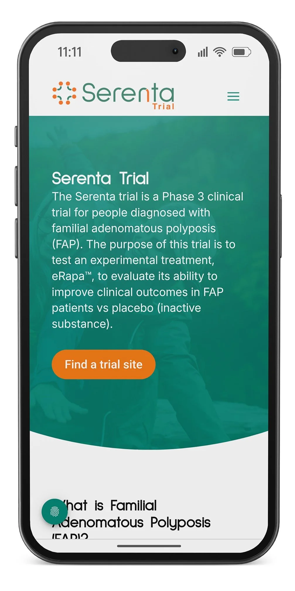
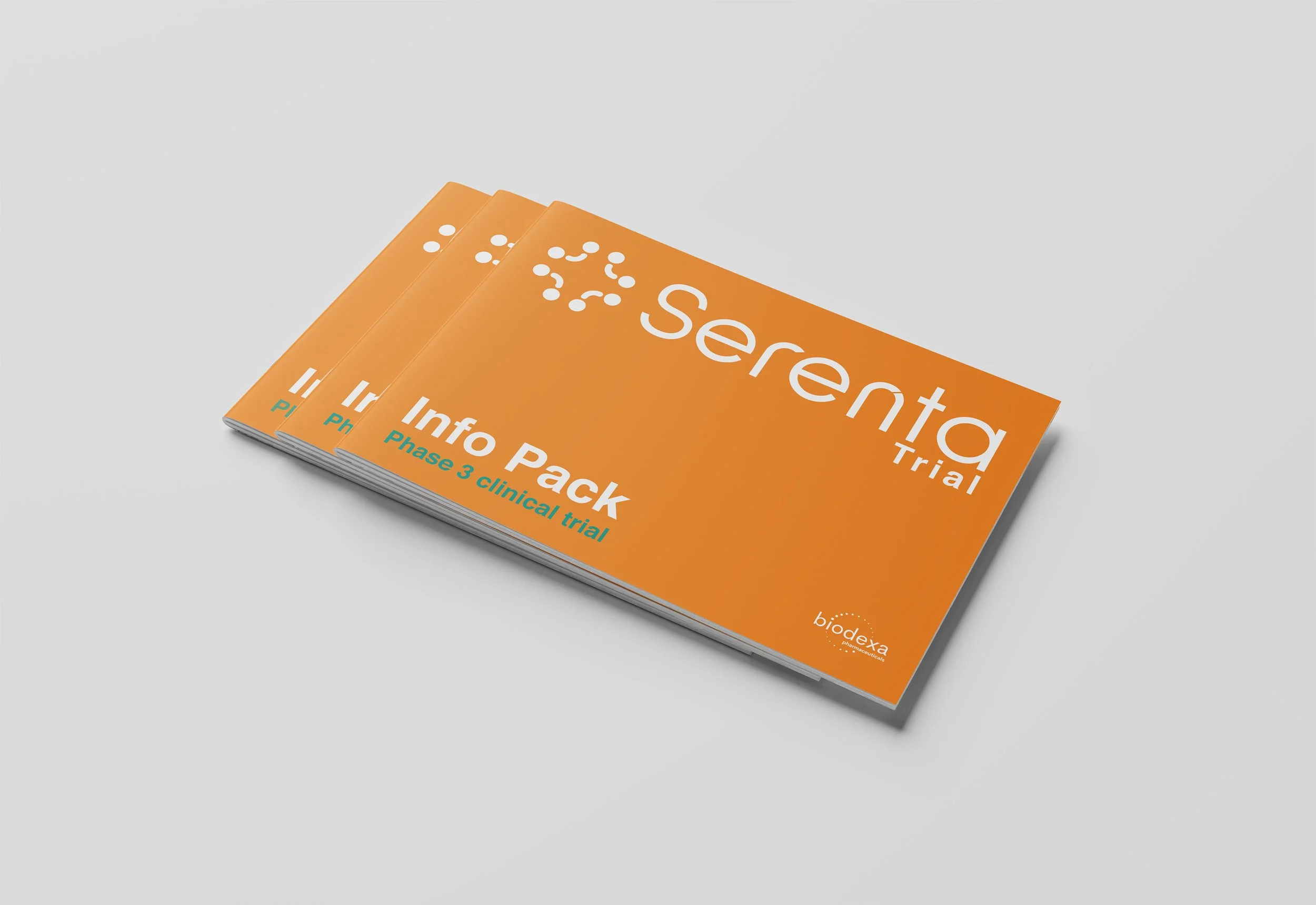
The brief required a study identity that would support patient trust and recruitment while meeting the standards expected in a regulated clinical environment. The identity needed to work across a wide range of materials including digital platforms, printed patient information, consent documentation and event and conference assets. It also needed to remain flexible enough to adapt as the trial progressed across phases and markets.
The Brief
Trial Name: Serenta
Company: Biodexa
Service: Clinical Trial Branding
Industry: Pharmaceutical / Clinical Trials
Website:serentatrial.com
Project overview
Our approach focused on clarity and restraint. Branding for clinical trials needs to communicate trust and consistency without unnecessary visual noise. We developed a flexible identity system that could be applied reliably across both digital and printed trial materials.
our approach
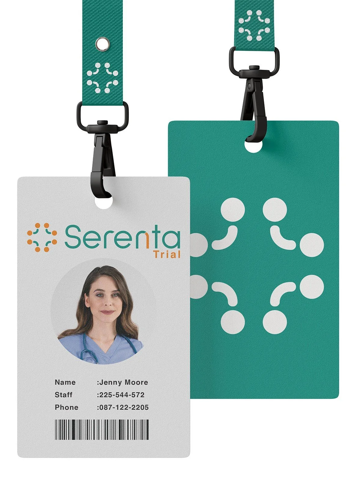
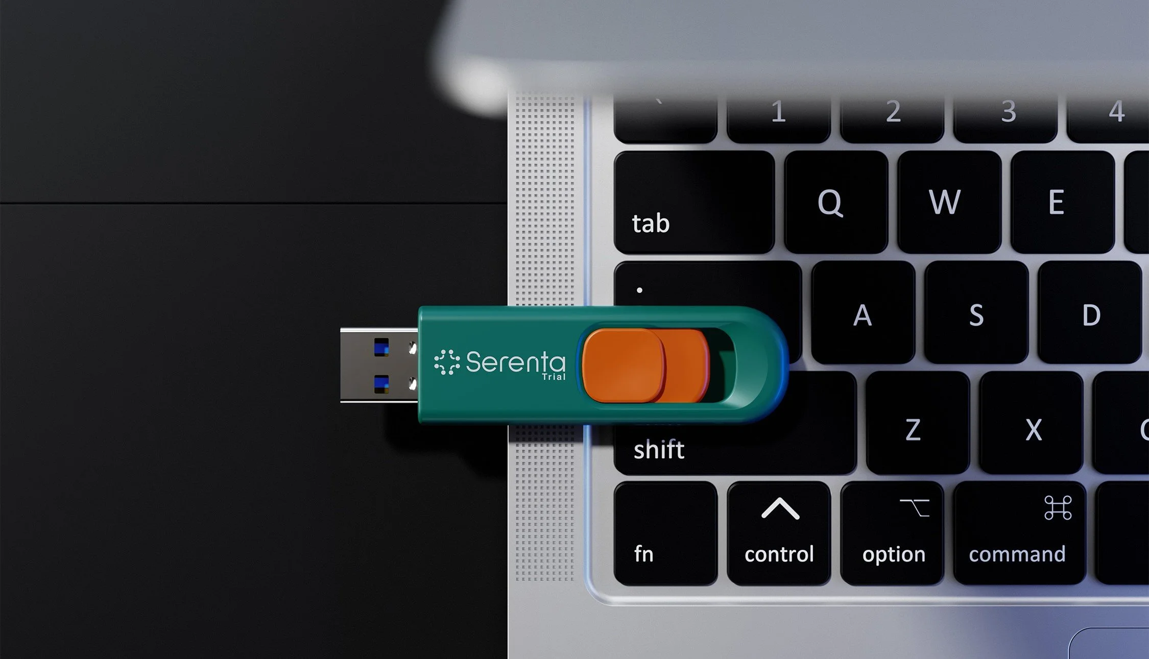
The final identity was designed to scale across multiple clinical trial formats, including documentation, presentation materials, and supporting visuals. Particular care was taken to ensure legibility, consistency, and ease of use in real world clinical and research settings.
Brand Identity & Application

The completed identity gave the Serenta trial a clear, credible visual foundation appropriate for a regulated clinical setting. The system has been deployed across patient information materials, digital communications and study documentation, providing Biodexa with a consistent and reliable design framework throughout the trial programme.
The Outcome


related services
You can explore our related services to see how we support pharmaceutical and clinical trial projects through branding and visual identity work.