
Clinical Trial Identity Systems — What They Are and What They Need to Include
A logo is not a brand. That distinction matters in most industries, but it matters more in clinical research than almost anywhere else. A clinical trial identity system is the full set of visual and communicative elements that work together to make a study feel credible, consistent and trustworthy to patients, to investigators, to ethics committees, and to anyone else who encounters it. Getting that system right is not a design exercise. It is a recruitment and retention strategy.
The reason it gets overlooked is understandable. Clinical teams are focused on the science, on the protocol, on recruitment timelines and endpoint data. Pharmaceutical branding sits well outside that frame of reference for most of them. But a study that presents itself inconsistently with different visual language on patient materials versus investigator documentation, a logo borrowed from the parent company and resized to fit, is communicating something unintended. It is telling people that the study was not built with the same care as the science behind it. Whether that is true or not, the impression sticks. And in clinical research, first impressions are rarely recovered from.
What is a clinical trial brand system?
A clinical trial identity system is the structured set of visual and communicative assets, including logo, colour palette, typography, templates and usage guidelines — that defines how a clinical study presents itself across every touchpoint of its lifecycle. It covers patient-facing materials such as recruitment brochures and information packs, as well as professional and industry-facing outputs including investigator documentation, presentation decks and digital communications. Its purpose is to ensure that every person who encounters the study whether a potential participant reading a poster in a GP waiting room or an investigator reviewing materials at a site briefing.
The clearest way to think about it is this: an identity system is what makes a logo feel like a brand. It is the difference between a mark that sits on a document and a presence that a patient can recognise, respond to and build confidence in over the course of a study. In clinical research, that trust is not incidental, it is functional. It influences whether someone agrees to participate, whether they remain engaged through follow-up visits and whether they would recommend the study to someone else. Understanding more about how that relationship between branding and recruitment is essential for good design. The connection between clinical trial branding and patient recruitment is more direct than most teams assume.
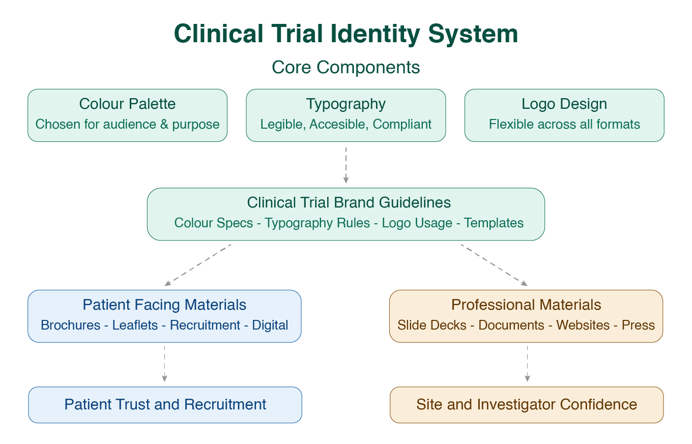
The Core Components of a Clinical Trial Identity System
A well-built clinical trial identity system begins with three foundational components. Each one is a decision, not a default. Choosing them carefully rather than inheriting them from a parent company's brand guidelines.
Clinical Trial Colour Palette
Colour carries meaning in every context, and in healthcare it carries more than most. A palette that feels warm and considered communicates something fundamentally different from one that defaults to generic pharmaceutical blue. That is not a stylistic preference — it is a strategic one. Patients respond to visual warmth in ways that affect engagement and trust, and that response is well documented in health communication research.
For multi-site clinical trial branding, colour consistency becomes a logistical as well as a visual concern. When a study is running across several countries, with materials being produced or adapted locally in different markets, a colour palette without precise specifications breaks down quickly. Slightly different interpretations of the same colour across print suppliers, screen profiles and translation partners will produce materials that no longer feel like they belong to the same study. Define your colour values and stick to them.
Typography for Patient-Facing Materials
Typography is the component most often underestimated in clinical trial design. Font choices need to meet accessibility and legibility standards particularly for patient-facing materials where readers may be older, may have varying levels of health literacy, or may be reading in a second language. The wrong typeface at the wrong size in a patient information leaflet is not just a design problem. It is a comprehension problem.
At the same time, the typography system needs to work consistently across a wide range of formats from a printed consent form to a digital recruitment page to a slide deck at an investigator meeting. A considered typographic hierarchy, with clear rules for heading weights, body text sizes and spacing, is what allows a clinical trial brand to function coherently whether it is being applied by the core team or by a local site coordinator working from a template.
Clinical Trial Logo Design
A clinical trial logo is not simply a piece of text formatted in a particular font. It is a mark that will appear at a wide range of sizes, across an equally wide range of surfaces like website headers, document footers, printed brochures, presentation title slides, press releases, packaging. It needs to hold up in all of those contexts without losing legibility or visual integrity.
That requires considered construction from the outset. Proportions that work at small scale. A form that is recognisable in black and white as well as in colour. Clear rules for minimum sizing and exclusion zones. Trial logo design done well produces a mark that is genuinely flexible, capable of carrying the study's identity across every format it will encounter, without modification or compromise. The Serenta clinical trial brand case study is a useful illustration of what that looks like in practice: a logo and identity built specifically for the study, not borrowed from an existing corporate framework.
Clinical Trial Brand Guidelines: What They Are and Why They actually Matter
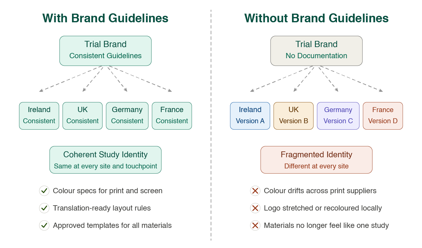
A brand identity without documented guidelines is, in practice, only as consistent as the last person who applied it. Clinical trial brand guidelines are the formal reference document that specifies exactly how every element of the identity system is used — colour values, typeface weights and sizes, logo clearance rules, approved and prohibited logo variations, tone of voice direction, and template systems for the full range of materials the study will produce.
For single-site studies with a small, stable team, that document can be relatively light. For multi-site clinical trial branding — studies running across several countries, with materials being produced and adapted in different languages, by different teams, under different regulatory environments — it becomes an operational necessity. Without it, the identity fragments. Colour drifts. Typography gets substituted. The logo gets stretched, recoloured or placed over backgrounds it was never intended for. By the time the inconsistency is noticed, it has already reached patients and investigators at multiple sites.
Good clinical trial brand guidelines anticipate the real-world conditions in which the identity will be applied. They account for translation — specifying how typographic layouts should adapt when text length changes significantly between languages. They address print and digital specifications separately, since the production environments differ. They include guidance on photography style and illustration if those are part of the visual language, and they specify tone of voice clearly enough that a copywriter or local communications team can write on-brand materials without requiring individual review of every document.
The European Medicines Agency, through its guidance on patient-centred approaches and plain language communication in clinical research, identifies consistent, clearly structured communication as a factor in patient understanding and engagement across the lifecycle of a study. Guidelines that build that consistency into the system from the outset are not a bureaucratic exercise. They are the mechanism by which the identity does its job reliably, at scale.
Why Clinical Trial Branding Is Treated as an Afterthought — and What It Costs
The pattern is consistent across the industry. Pharmaceutical companies and biotech organisations will allocate significant resource to data management, site selection, regulatory affairs and patient monitoring. Very little of that resource finds its way to how the study actually presents itself. The branding is treated as a cost rather than a tool — handled internally, or delegated to someone without specific experience in regulated communication design, or simply lifted from the parent company's existing visual identity and adjusted to fit the study name.
The result is a study that may be scientifically rigorous but visually and communicatively underdeveloped. That gap is not invisible. It shows up in patient-facing materials that feel corporate rather than considered. It shows up in investigator decks that look like internal presentations from three years ago. It shows up in inconsistency across sites that erodes the sense of a professionally managed study. And ultimately, it shows up in recruitment. The Tufts Centre for the Study of Drug Development has tracked for years how recruitment and retention difficulties extend trial timelines and compound costs and how the materials used in patient outreach directly affect willingness to participate.
Many of the most common failures are predictable. The visual identity mistakes pharma teams make with clinical studies tend to follow a familiar pattern, and most of them are avoidable when the identity system is built with appropriate care and specificity from the outset.
A clinical trial identity system is, at its core, a practical tool. It is built to make every piece of communication more reliable, more consistent and more accessible across the full lifecycle of a study, and across every market and site team that will work with it. The teams that treat it that way tend to find that it pays back across every stage of the work.
Frequently Asked Questions
What is included in a clinical trial identity system?
A clinical trial identity system typically includes a logo and its usage rules, a defined colour palette with precise specifications for print and screen, a typographic system, and a set of document and presentation templates. It also includes clinical trial brand guidelines, a reference document that ensures the identity is applied consistently by every team member and external partner working on the study.
How is a clinical trial identity system different from standard pharma branding?
Standard pharmaceutical branding is built to serve a company's commercial and corporate identity across multiple products and markets over time. A clinical trial identity system is purpose-built for a single study, designed to speak to a specific patient population, operate within a particular regulatory context, and function across the specific materials and formats that study will produce. The scope is more defined, but the rigour required is no less.
When in the study lifecycle should a clinical trial brand be developed?
As early as possible — ideally before recruitment materials are being drafted. The identity system informs every patient-facing and site-facing communication, so developing it after those materials are already in production creates unnecessary rework and inconsistency. Beginning the branding process at the protocol planning stage means every subsequent material is built on a coherent foundation rather than retrofitted to one.
Do patient-facing materials need their own design guidelines?
Yes. Patient-facing materials have specific accessibility, legibility and plain language requirements that differ from investigator or corporate communications. A well-structured identity system will address these explicitly, specifying minimum type sizes, reading level guidance, contrast ratios for print and screen, and layout rules that account for translation across different languages and markets.
Can a clinical trial use the parent company's existing branding?
It can, but it rarely serves the study well. Parent company branding is built for commercial and corporate communication, not for the specific trust-building requirements of patient recruitment and retention. Applying it without adaptation often produces materials that feel impersonal or overtly commercial which can affect how patients perceive the independence and purpose of the research. A dedicated clinical trial brand, even one developed within the parent company's broader visual framework, will typically perform better across patient-facing touchpoints.
If you are in the early stages of planning a study and want to understand what a considered identity system would look like for your trial, see our clinical trial branding and design services or get in touch directly, it is a conversation worth having before the protocol is finalised.